
Design Challenge
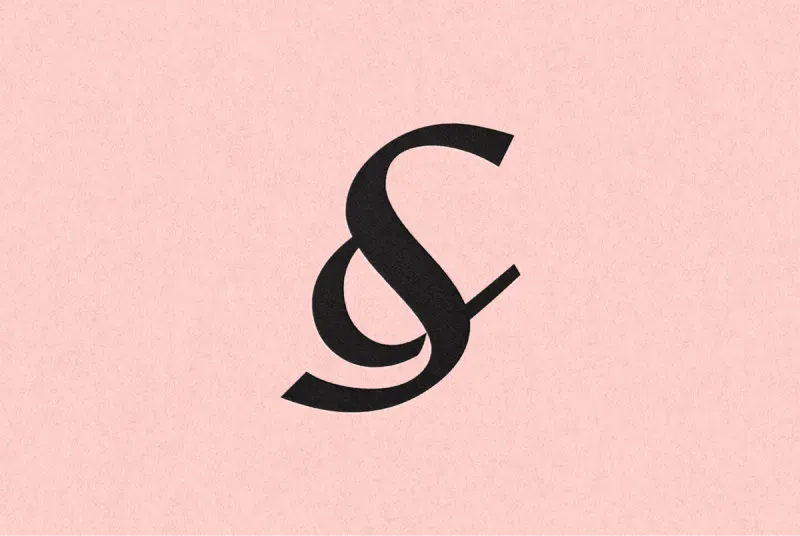
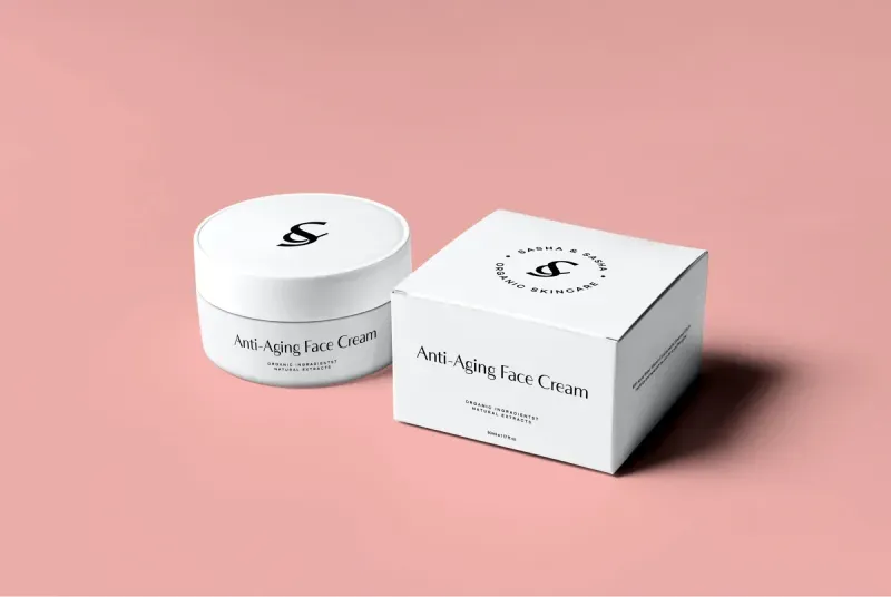
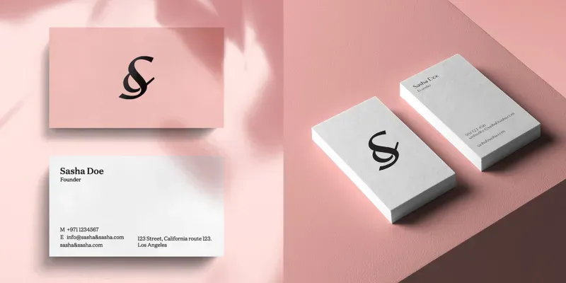
Our challenge was to make a brand design identity that speaks sophistication but still making it premium looking. We started by working with ampersand because Sasha is a big fan of ampersand so we decided to incorporate the alphabet “S” into the ampersand to give a more premium luxury cosmetic brand feel to the brand identity. The main task was to create a whole brand identity and packaging design. Their main goal was to show their main values in branding and create a premium look of the product to help them worthwhile compete with their premium competitors’ brands.
SERVICES PROVIDED

About
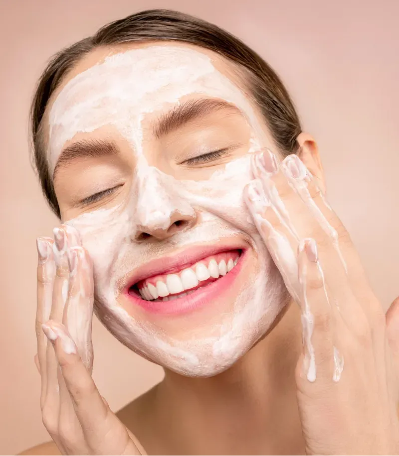
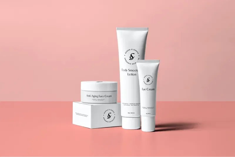
Sasha & Sasha is a premium organic skincare brand. Their main focus is to give you beautifully moisturized skin with full skincare protection. The brand targeting women 30-60 years old.

Skincare Branding-The Solution
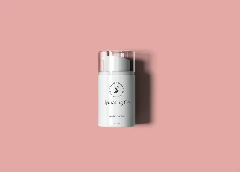
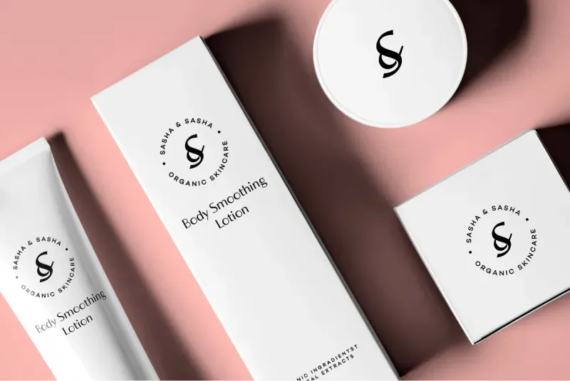
We started by working with the ampersand clean logo mark, typography. Keeping its super clean minimal brand design approach decided to incorporate the S into the ampersand to give a more premium feel to the brand identity.
The brand color palette consists of 2 colors which are pink pastel colors as an emphasis on any skin tone, with the main color accent – black, which perfectly associates with the luxury theme. Designing a sophisticated brand identity including the naming, identity & packaging with a clean aesthetic, elegant typography, and an overall premium cosmetic brand feel.


 512-333-4515